

💌 The Delightfulness Project: Coloring outside the lines
💌 The Delightfulness Project: Coloring outside the lines
How to significantly improve your user experience, by understanding color

Welcome to the latest issue of The Delightfulness Project, a monthly write-up exploring what makes products delightful. If you were forwarded this issue, you can subscribe here.
Hello readers!
A few weeks ago, Google released a set of new app icons, meant to tie together their digital products. You know them: Google Drive, Google Sheets, Google Docs, Google Maps, etc, etc.
From a branding perspective, it was a logical move— rather than having each app represented by a different color, why not bring them together?
Unfortunately... most people disagreed. 👀
Case in point: the post below that started making its rounds on Reddit shortly after the announcement.

Oops.
This incident got me thinking about color and how it’s used in products and design. Why does color work so well in some products and not in others?
To help us understand, let's start with the bad.
A Terrible Study in Color 😱
In 2015, Sherwin-Williams, the American paint company, came out with an absolutely horrendous logo redesign (below) that— despite the horrifying and controversial public backlash— remains the company's logo to this very day! The main issue? Color.
Why was this logo so bad?
In a listicle of "15 Business Logo Fails" (where this Sherwin Williams logo ranked #1), the author says it best:
“The paint company has already been met with controversy for contributing to both lead poisoning and contamination, and their logo—which depicts the earth being coated in unnatural, blood-red paint—conjures up images of the poisoning or polluting of the planet.”
To this day, this logo still reminds me more of a bloodthirsty world conqueror than a paint company, but honestly, with all the controversies that Sherwin-Williams has been involved with, maybe the logo is sneakily intentional? 👀
But… I digress. Back to color!
We just looked at a terrible example of color in branding. But how does color affect a product’s usability? 🤔
Among Us is an online multiplayer game that has swept the world. If you’ve never tried it, here's quick overview: you and other players are crew mates on a large spaceship, with many tasks to complete. Unfortunately, one of you is an imposter (gasp!), whose goal is to sabotage the ship and kill everyone else! Only through careful group deduction can you unmask the imposter.
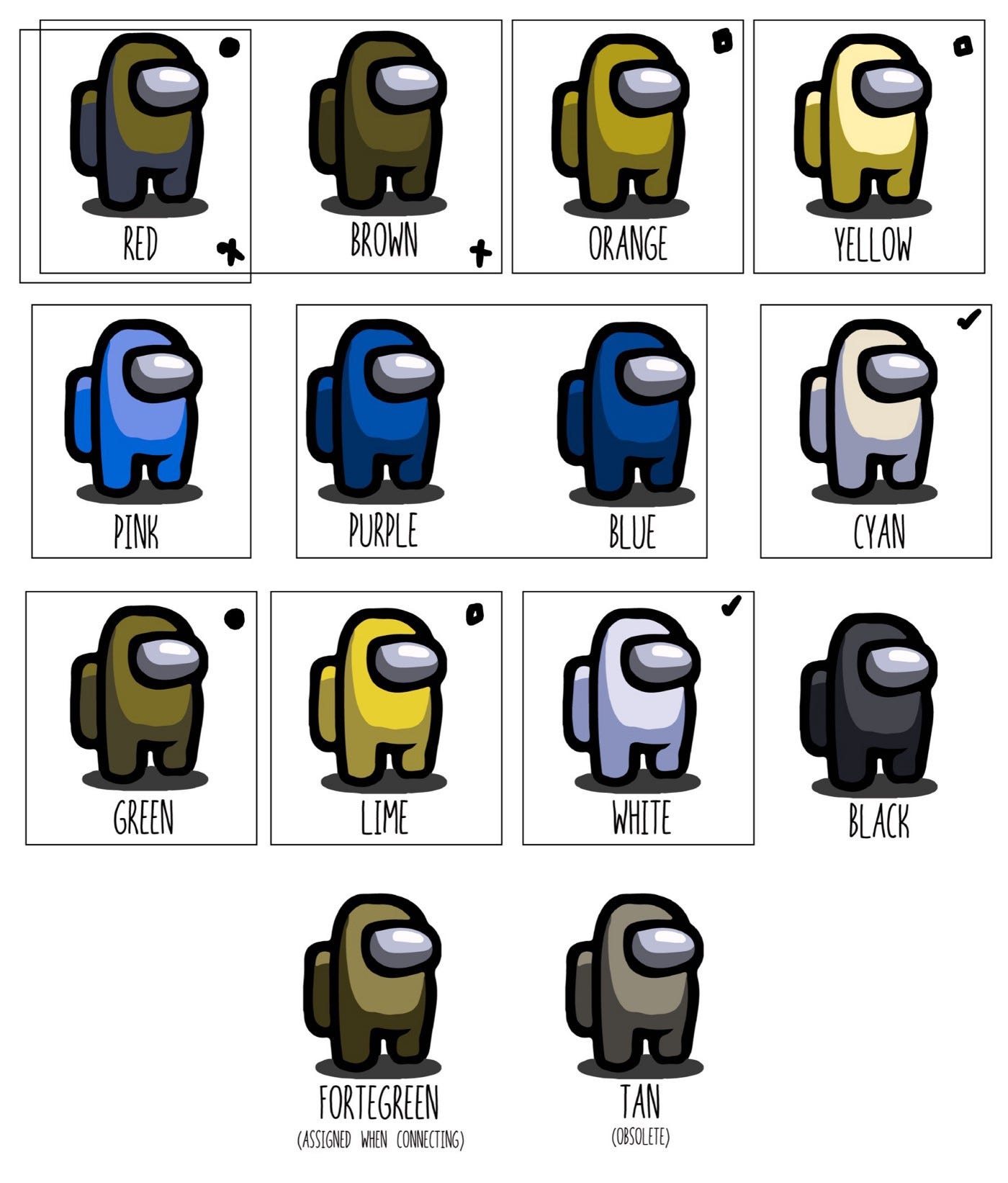
Among Us uses a notoriously simple interface, where colors are the main way to distinguish players. Currently, players can choose between 12 different colors, but unfortunately, these colors are not colorblind friendly. About 300 million people around the world live with some type of colorblindness. Depending on what type of color blindness you might have, anywhere from 2 to 7 of the colors could be indistinguishable, making it very hard to tell players apart.
Here’s an example of how players might look like to someone with protanopia, a form of colorblindness, where red and green can’t be seen.
In a game based on observing others to survive, this design issue is huge burden for colorblind players. But wait, there's more!
One of the tasks in the game, "Fix Wiring", asks players to match broken wires from one side to another. Unfortunately, the wires are only distinguishable by color, a task that was completely impossible for players with monochromacy, another type of colorblindness.
Below is an example of what the wiring panel looks like to players with full color vision (left) and what the panel might look like to players with monochromacy (right).
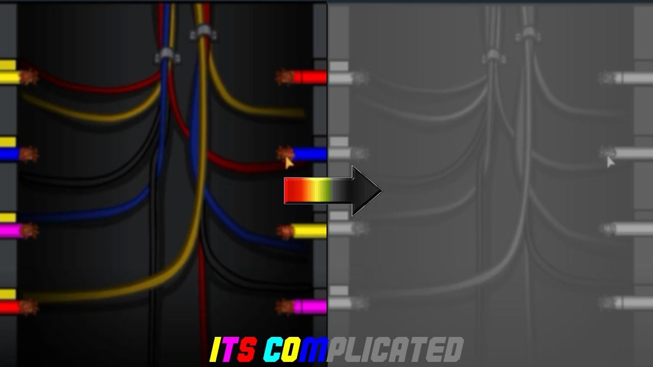
As you can see, the left side shows colors in full, while on the right side, the differently-colored wires are indistinguishable.
Luckily, these issues won't be here for long. On November 20 (just days ago), Among Us released a recent patch, adding symbols to identify each colored wire. Their team has confirmed that additional colorblind support will be added in future updates.
So… Why Color? 🎨
The truth is, we humans are incredibly visual creatures. "More than 50 percent of the cortex, the surface of the brain, is devoted to processing visual information", says David Williams, a professor of medical optics at University of Rochester.
Within this visual realm, color plays a crucial role, helping us identify danger, influence our mood, and even shift our body's natural cicadian rhythm.
In design, color can be used to improve usability, increase conversion rates, and save device energy.
In this issue, I hope to help you learn how to think of color as your own tool for making products more delightful and effective. 💖
In This Issue
In this month's newsletter, we'll dive into the power of color in product design, including:
4 principles on using color to improve your product usability: Clear steps and examples on how to incorporate color into your products and enhance the user experience.
3 stories from colorblind creatives: A spotlight on personal stories from leaders in the product and design industry and their perspectives on colorblindness as a strength.
5 hand-picked resources to dive into color experimentation and learning: A curated mix of introductory content and interactive tools to kick start your personal learning journey. This is my favorite list of resources to date!